
Brand and Website Design for Mario Wagenaar Photography
WEBSITE design, brand design

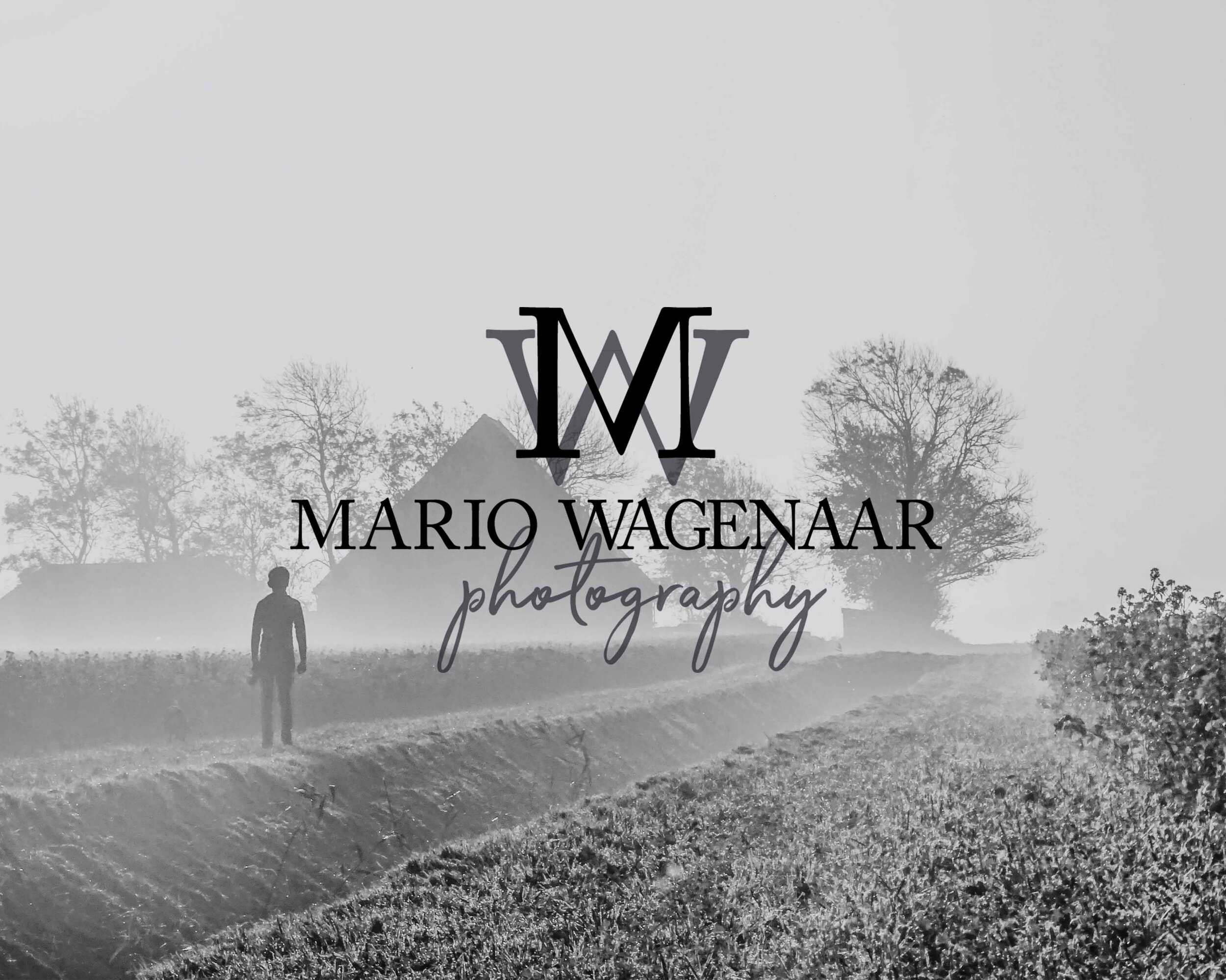
About Mario Wagenaar Photography
When Mario contacted me about working together because he was serious about starting his own business I was thrilled because we already knew each other. As Mario was still in the beginning stages of setting up Mario Wagenaar Photography we spend some extra time on his brand strategy and in particular who his ideal client would be.
In the Brand Design Questionnaire that I use to start every project, Mario mentioned he likes to photograph nature, landscapes, wildlife, concerts, festivals and performances. As these are quite a few different directions with different types of clients we looked at what direction might work best. After Mario spoke to a fellow nature photographer advising to go in the direction of music and theatre this was going to be the focus of the brand.
STRATEGY BEHIND THE DESIGN
The keywords that Mario used to describe his business were going further, think differently and personal approach. The images that we, therefore, chose to use as inspiration were focused on music, photography, looking further and different angles. But to make sure the images were at the centre of attention the colour palette are different tints and shades of grey and black combined with an off white to keep it minimalistic. With one accent colour to add some light in the design.
I always like to include a quote in the mood board to represent the overall feeling. For Mario’s brand we choose the below:
“Don’t be like the rest of them Darling”


Squarespace website
The last step of the design process was Mario’s Squarespace site. Since photography is the base of the entire brand, the main goal of the website was to showcase Mario’s photos as much as possible. With the focus of the services being on music, concerts and theatre the images for the homepage and portfolio pages are all related to that. But with Mario having so much love to nature and wildlife photography we added a page that can only be accessed from the about page to showcase his nature portfolio.
To continue with the minimalistic look of the logo’s the focus on the website is really on the pictures without any frills or elements that can lead the attention to something else.


If you thought this post you might also like:


LOOKING FOR ANYTHING?
popular in the shop


FOLLOW ON INSTAGRAM


favourite
resources
*Below links are affiliate links and I get a small kickback if you use these links to sign up.

I was not expecting this at all from the Dubsado setup Guide, it will answer all my questions