
Brand Design for Rising River Marketing
Brand strategy, Brand design, website audit

About Rising River Marketing
When Stephanie came to me because she wanted to transition her business from her own name to Rising River Marketing. And with a new name she was looking for a new logo and colours to represent the new direction she was taking her business in.
In the Brand Design Questionnaire that I use to start every project, Stephanie mentioned that the mission of her business was to help people. And that this is at the heart and soul of why she is a copywriter for mental health professionals and coaches. She enjoys helping people and found that she had two choices - she could either go to school for psychology and become a therapist herself, or she could write content that could help people while also helping local businesses grow.
Website: Rising River Marketing
Instagram: @risingrivermktg
STRATEGY BEHIND THE DESIGN
In the Brand Design Questionnaire that we discussed during our strategy call, Stephanie mentioned that she really did not want to use pinks or anything that looks too feminine. And that she would like to have something that's a little more fun than just neutral. She also wanted to include script or an handwritten font, but that also this should not come across too feminine or laidback.
The keywords that Stephanie used to describe her vision of her new direction were friendly, trust and compassion. And the overall brand needed to be easily approachable which why we choose for colour palette with warm colours.
I always like to include a quote in the mood board to represent the overall feeling. And this is the one we choose for Rising River Marketing
“Be brave, be kind, be gratefull”


If you thought this post you might also like:


LOOKING FOR ANYTHING?
popular in the shop


FOLLOW ON INSTAGRAM


favourite
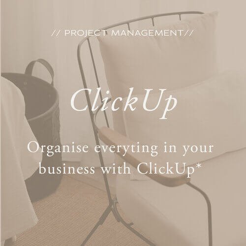
resources
*Below links are affiliate links and I get a small kickback if you use these links to sign up
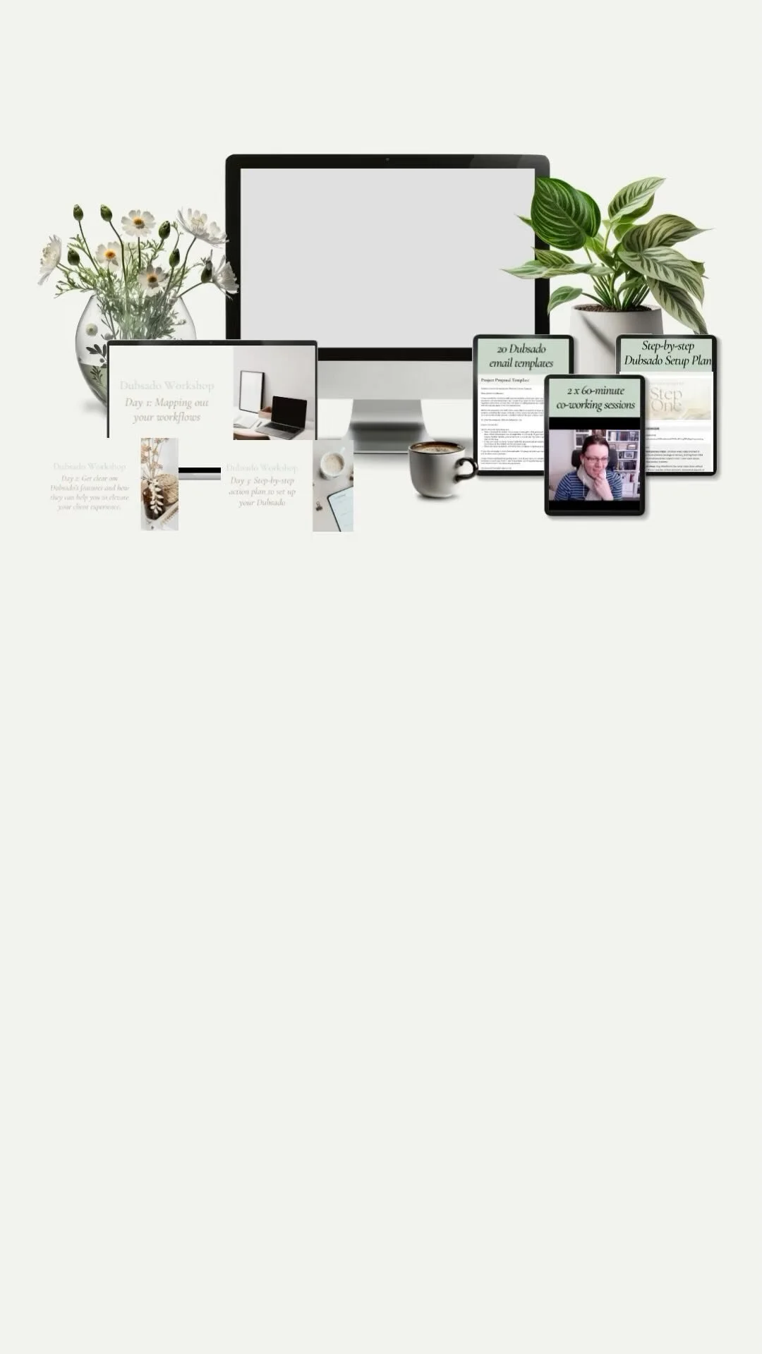
I was not expecting this at all from the Dubsado setup Guide, it will answer all my questions